

I don’t actually know what the proper name for it would be. Promo art? Cover art? Thumbnail? With everything being increasingly digital we don’t have that many DVD boxes anymore.
What I’m referring to is those images that accompany new releases and get associated with a show. The ones streaming sites use. I’m very sorry for everyone that clicked on this post hoping to see some sweet sweet pics of anime boxes. I don’t judge.
Anyway, with the new season looming, I’ve been looking through a whole bunch of these and I think it’s time I shared some of my favourites. I’m going to pick from only shows I have seen cause otherwise this list would never end. I’m also not including OVAs or movies. It’s a very incomplete list is what I’m saying:
ACCA-13

Man this is an amazing cover. The composition is just wonderful. The red and whit (off white) colouring paired with the bird imagery just screams despotism, while the collage of characters in said bird give us a taste of the wide and varied cast. Nino is fairly prominent and placed at Jean’s back. Although subtle, he is the only character that goes outside the bird’s outline. All of this is very symbolic of their relationship and foreshadows Nino’s role so well. And Jean himself isn’t, beaming at the camera or mid action. He is side eyeing us suspiciously. This one image evokes not only the mood but up to a certain degree the story of the show fabulously while being extremely eye catching. Great Job!
Attack on Titan

You would be surprised how few of these actually incorporate a setting. I guess it’s to avoid making the image too busy. But in Attack on Titan, the setting as a huge part of the personality and identity of the show, especially in the early seasons. This is why this image is so smart, the burning village and overwhelming wall with a monstrous titan looming. It’s immediately frightening and gives us a sense of urgency. We need to find out what’s happening, now! Couple that with the ochre colours that make the scene suffocating to behold but tie everything together and will make the image stand out in a group. Man humanity looks small and yet proud!
Blend S

I don’t know if this pick will surprise anyone. It’s a pretty big contrast with the previous one. I like pink though so such an overwhelmingly pink image is bound to catch my attention. But then, when you look a bit closer, the cuteness of tiny but detailed characters on a cake plate is sort of whimsical and charming while keeping Maika in full scale is both visually striking and allows the audience to really appreciate the cute girl design. I think it stands out in a sea of girly group photos.
Erased

I think Erased might have one of the most evocative covers. When I look at this image I sort of feel like I’m there. It’s a bit cold and uncomfortable but there’s also something hopeful or safe. The way Satoru’s face is set in determination is a stark contrast to helpless sleeping Kayo. Also the light in this shot is fantastic. Those looming shadows are foreboding yet harmless. I just want to know what’s going on, how did those kids get there, what are they about to do! It’s a great way to sell the story without giving anything away.
Flowers of Evil

Even though I didn’t like Flowers of Evil that much, I still think this is one of the best covers I have seen. The town is so beautifully detailed and precise while that sootball of a flower clashes in every possible way. It’s a completely different art stile, it’s pure black ink against the fully coloured background, it even uses thicker curvier lines, as if drawn by brush to contrast the mechanical pen style of the image. It’s utterly out of place as it should be. I wouldn’t exactly call this image frightening as much as it is captivating. And Captivating is a very good thing for a cover to be!
Haibane Renmei

Every time I talk about Haibane Renmei, I think to myself that I should re-watch Haibane Renmei. That’s a pretty good sign. This cover art isn’t that original in composition. The circle of characters lying down is fairly common but what elevates the image is first the beautiful wood pencil look and art style, the close crop of the image that only shows the girls from the shoulders up which is unusual and makes their facial expression a much more dominant part of the design, and finally the relaxed sort haphazard placing of the characters. It’s not a perfect circle. That’s important. Despite the halos and wings, these are not perfect girls. Oh, there’s also a bunch of halos, that’s sort of visually interesting I suppose….
Megalo Box
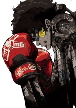
Admittedly, I like white backgrounds. I think they are very impact. On top of that, Joe is essentially black and white with the only colour additions highlighting the boxing aspect of the story, rather than the sci fi mecha one. This makes the spiritual successor to Ashita no Joe angle just a bit more prominent. It’s a simple image of the main character but there is a lot going on. The robotic exoskeleton makes you wonder what the heck is going on and the high contrast makes the image jump at you.
Mononoke
![ポスター文字入り [更新済み]](https://i0.wp.com/drunkenanimeblog.com/wp-content/uploads/2020/06/Mononoke.jpg?resize=251%2C354&ssl=1)
If MegaloBox decided to make it’s mark through a spartan colour scheme and clean design, Mononoke went the opposite way. There is so much going on here. Arguably too much. But it’s that excess that really makes it stand out. Not to mention that Mononoke is a visually excessive show in many ways. In fact, you could argue that the cover is rather tame. Also, there’s not that much dominantly yellow cover art so when I look at my list, this image really pops out!
Monthly Girls Nozaki Kun

In many respects, this is a pretty boring piece of Box Art. However, I realized I hadn’t talked about Nozaki-kun in a while and I thought it was high time I reminded everyone that I really love Nozaki-kun. And also, it’s not at all a bad cover. It has that white framing, the images being disposed like manga panels is relevant to the story and it’s a pretty great way to get close ups of all the characters in one single image. Also there’s a Tanuki and a background image of the school to give us some sense of setting. I just threw in there that there’s a Tanuki with no explanation or detailing why that matters. It matters!
Paranoia Agent

This is one of my favourites..obviously…it’s on my list of favourites. Still Paranoia agent may have the best use of colour in this entire list. The thematically significant red of the background with those darker lines reminiscent of an old TV screen. It frames Golden Bat but it also makes the rest of the cast seem not quite real. If you’ve seen the series you know why that matters. Golden bat has his distinctive uniform which devoid of meaning seems almost cheerful against that background. That huge shadow in front of him is downright ominous and again, he is the only one that casts one. The fact that everyone’s head is cut off makes the entire scene very unnerving.
The Ancient Magus’ Bride

I don’t know what to say…I’ve always liked this image. Even though it really is very creepy. And knowing the events of the anime only makes it creepier. But to me, it looks like a Christmas tree…
The shaft of light and magical vines all combine to create a very unique sort of look and carving out the image in an more triangular shape sets it apart from the overwhelmingly rectangular ones. Still a bit creepy.
Future Diary

I mentioned it in relation to the Paranoia Agent image but I kept it brief to go on in more detail here. Yuno is cut off at the neck. Cutting off characters is always a bit unsettling unless there is just so many of them it sort of blends in. In this case though, there’s only two so it stands out, not to mention that she is pretty much exactly decapitated. However, they are standing on a reflective surface, which still allows the artist to show Yuno’s face but it’s cast in deep shadows. There’s also an unclear silhouette reflected in the background for an extra dose of mysterious and scary. No wonder Yuki looks so uneasy. This one image made me want to see the series so bad.
That’s it for now. Although there are a lot more that I find very pretty. I should say that looking over all the box art in my AniList listing, I noticed that 90% of the images were some type of varying degree of dynamic group shot. It really got super repetitive quickly.
Maybe it’s just a consequence of the anime I have watched.
Do you have a favourite covert art? Is it weird to have one? Or like 12….

I do quite like NANA’s!
The two face shots?
Yeah!
Wow, this is a pretty sweet idea! I’m not the biggest fan of SayoAsa, but I gotta admit, the key visual out here looking pretty sweet.
https://s4.anilist.co/file/anilistcdn/media/anime/cover/large/bx99457-Oslsfe1w0VOi.png
It just really says a lot about the film while (ironically) having barely anything in its visual.
That looming sky over a contrasting yellow field. Wonderful image!
Hmm… Not sure I have any personal favourites that I can name without looking them up to refresh my memory; though I do think every single one of these is a good pick. I love the eeriness of the flower in Aku no Hana, and it always makes me remember the creepy outro theme. I think my favourite of these is the Mirai Nikki one– it captures Yuno’s character and role in the story so well, without any flashy over-the-top visuals.
As for what’s not mentioned here, I also like the key visuals for Deadman Wonderland… for no other reason than the art style in general is terrific. Shiro is arguably one of the most visually unique characters in anime/manga.
Oh yeah, Deadman is a great image.
Also the Flowers of Evil outro is one of the all time best I think. I never once managed to skip it.
I love the Japanese covers/key art for the Sailor Moon R and S movies.
So nostalgic! Great pick
Those are called “key visuals” or “key art.” They’re really important in marketing a series, since they’re usually the first thing people see, so they have to make a strong impression. You made some really good picks here. That Attack on Titan key art is iconic, and I’ve always liked Nozaki-kun’s, too.
Some others that I remember making really strong impressions on me are Bakemonogatari (the one with the girl lifting up her skirt while a bunch of school supplies fall out), My Neighbor Totoro (the one with the tiny girl standing in the rain under her umbrella next to the giant creature), Girls Last Tour (the one where the two girls are sitting with their backs to the viewer, looking out at the landscape full of crumbling buildings), and Kara no Kyoukai Part 7 (the one with a blood-stained Shiki sitting on the ground while Mikiya embraces her from behind). All of those are immediately attention-grabbing and make the viewer (or at least me) want to know more about this anime.
OMG, that’s what key visuals are!?! Thank you!!! O wow, I forgot Totoro, that is a great image, no wonder it became iconic.
The Perfect Insider has some interesting art – it’s a take on that staircase optical illusion. A lot of the stuff in the art is relevant, but you don’t know what exactly will be relevant until you watch the anime.
I also really like Fugou Keiji’s and ID: Invaded’s use of colour and placement, although it’s just another group shot. One version of ID’s (there’s 3 art pieces, but the green one was on Funimation first) is kind of like ACCA’s, too.
Oh yeah, Perfect Insider, nice pick. I didn’t care for that series so I’d kinda forgotten about it, but that was a good piece of art.
I haven’t watched The Perfect Insider but I remember finding the cover very interesting.
ID Invaded has beautiful colours indeed.
Ooh, those are nice covers. Many of them are so iconic that I don’t properly see them any more (ACCA, Erased, Megalo Box, Ancient Magus Bride), so it’s always nice to take a debliberate look and appreciate anew just how great they are.
I really like the covers of my edition of Isshukan Friends: Here they are. (There’s a thumbnail of the second one near the bottom of the page; I like how the covers focus on the two main characters and portray their progression just by positioning and facial expressions; and the art is just so nice.)
My favorite is Erased, for all the reasons you mentioned. AOT and Ancient Magus are also brilliant.
The lone warrior standing against an impossible and implacable evil… I always find that sort of thing stirring.
Ancient Magus is a fantastical rendering of the “beauty and the beast” mythos. I don’t find it particularly creepy because the Magus isn’t human. He is a completely different species and while learning to love, he is not likely capable of sexual desire. I think of “bride” as being shorthand for a close emotional bond with mutual dependency. In their own ways, both are using the other to become more fully actualized. I want another season.
Of course, they are all good covers.
I find it creepy because he’s a huge skeleton beast creature holding a small human. He could eat her at any time. Maybe I’m just a little slow but I didn’t really see any sexual undertones in that picture. Even in the anime, I mean there are implicatons but it’s present rather asexally…. I know, that’s a hot topic
Mononoke is probably my favourite one from this list. It just looks so cool and really portrays the anime’s visualistic style too.
The visuals in Mononoke are mesmerizing. I have Mononoke art all over the house
You never fail to take a completely random idea and make it interesting to the point where I have to say why hasn’t anyone done this before.
Wow really? ‘m sure someone has but I may pay attention to random things sometimes
I really like the promo art for Attack On Titan and ACCA-13.
Some of my favorite promo art has to be this and i see this being the driving factory for me getting into the series and having all of the currently released blu ray copies in the west.
https://tamarket.files.wordpress.com/2018/10/97c6120bf86387ef2b045805c2197a0f1540659802_full.jpg?w=640&h=905
https://images-na.ssl-images-amazon.com/images/I/A1PGBkstOLL._AC_SX522_.jpg
https://static.zerochan.net/PSYCHO-PASS.full.1463394.jpg
https://images.sgcafe.net/2019/03/PP3_key_fixw_640_hq-1-1.jpg
PP2 also has a very similar cover, they really keep the visual theme going
Thats what i noticed too.
Yeah, that ‘Flowers’ one is tops – I love the ‘ACCA-13’ one too.
This is a bit similar perhaps, but I really like this version of the ‘Wolf’s Rain’ dvd/blu-ray:
https://images-na.ssl-images-amazon.com/images/I/61AGiGLGLoL._AC_SY400_.jpg
ooohhh that’s pretty
It looks so satisfying to my eye with the use of softer colours and use of line too, wish I had a poster of it!
I really appreciate good anime, game, movie, book covers. Whoever said “don’t judge by the cover” was only partly right, because I think you can tell a lot from how much effort went into making the cover design distinctive and interesting. Though I’ve definitely been burned some of the times I’ve checked something on the strength of a good cover alone.
I can’t think of any other anime ones, but I do like the old Playstation SMT remake covers, sort of 90s anime-looking with those angelic and demonic themes common in the series.
Oh yeah! The Persona games all have pretty amazing covers
Attack on titan’s box art is amazing, and Blend S is famous because it’s a meme, but I never appreciated how amazing Megalo box and Aku no Hana’s cover art actually looks. In a similar vein, but not quite, the manga volume covers of manga like Yugami-kun doesn’t need friends are also very beautiful.
They are! A lot of Manga have amazing covers!
I really like Megalo Box, Mononoke and Blend S you shared.
I really like the some of the Box Art for Rolling Girls as well , the one with the falling stars not the one on the road, even though the anime got boring enough for me to drop.
Cat Soup is another art I really like.. it’s cutesie weird and gloomy all at the same time, even though it isnt that special I really love it for that.
I looked them up and they are both really interesting promos. I haven’t seen either series.