


I don’t actually know what the proper name for it would be. Promo art? Cover art? Thumbnail? With everything being increasingly digital we don’t have that many DVD boxes anymore.
What I’m referring to is those images that accompany new releases and get associated with a show. The ones streaming sites use. I’m very sorry for everyone that clicked on this post hoping to see some sweet sweet pics of anime boxes. I don’t judge.
Anyway, with the new season looming, I’ve been looking through a whole bunch of these and I think it’s time I shared some of my favourites. I’m going to pick from only shows I have seen cause otherwise this list would never end. I’m also not including OVAs or movies. It’s a very incomplete list is what I’m saying:
ACCA-13


Man this is an amazing cover. The composition is just wonderful. The red and whit (off white) colouring paired with the bird imagery just screams despotism, while the collage of characters in said bird give us a taste of the wide and varied cast. Nino is fairly prominent and placed at Jean’s back. Although subtle, he is the only character that goes outside the bird’s outline. All of this is very symbolic of their relationship and foreshadows Nino’s role so well. And Jean himself isn’t, beaming at the camera or mid action. He is side eyeing us suspiciously. This one image evokes not only the mood but up to a certain degree the story of the show fabulously while being extremely eye catching. Great Job!
Attack on Titan


You would be surprised how few of these actually incorporate a setting. I guess it’s to avoid making the image too busy. But in Attack on Titan, the setting as a huge part of the personality and identity of the show, especially in the early seasons. This is why this image is so smart, the burning village and overwhelming wall with a monstrous titan looming. It’s immediately frightening and gives us a sense of urgency. We need to find out what’s happening, now! Couple that with the ochre colours that make the scene suffocating to behold but tie everything together and will make the image stand out in a group. Man humanity looks small and yet proud!
Blend S


I don’t know if this pick will surprise anyone. It’s a pretty big contrast with the previous one. I like pink though so such an overwhelmingly pink image is bound to catch my attention. But then, when you look a bit closer, the cuteness of tiny but detailed characters on a cake plate is sort of whimsical and charming while keeping Maika in full scale is both visually striking and allows the audience to really appreciate the cute girl design. I think it stands out in a sea of girly group photos.
Erased


I think Erased might have one of the most evocative covers. When I look at this image I sort of feel like I’m there. It’s a bit cold and uncomfortable but there’s also something hopeful or safe. The way Satoru’s face is set in determination is a stark contrast to helpless sleeping Kayo. Also the light in this shot is fantastic. Those looming shadows are foreboding yet harmless. I just want to know what’s going on, how did those kids get there, what are they about to do! It’s a great way to sell the story without giving anything away.
Flowers of Evil


Even though I didn’t like Flowers of Evil that much, I still think this is one of the best covers I have seen. The town is so beautifully detailed and precise while that sootball of a flower clashes in every possible way. It’s a completely different art stile, it’s pure black ink against the fully coloured background, it even uses thicker curvier lines, as if drawn by brush to contrast the mechanical pen style of the image. It’s utterly out of place as it should be. I wouldn’t exactly call this image frightening as much as it is captivating. And Captivating is a very good thing for a cover to be!
Haibane Renmei


Every time I talk about Haibane Renmei, I think to myself that I should re-watch Haibane Renmei. That’s a pretty good sign. This cover art isn’t that original in composition. The circle of characters lying down is fairly common but what elevates the image is first the beautiful wood pencil look and art style, the close crop of the image that only shows the girls from the shoulders up which is unusual and makes their facial expression a much more dominant part of the design, and finally the relaxed sort haphazard placing of the characters. It’s not a perfect circle. That’s important. Despite the halos and wings, these are not perfect girls. Oh, there’s also a bunch of halos, that’s sort of visually interesting I suppose….
Megalo Box
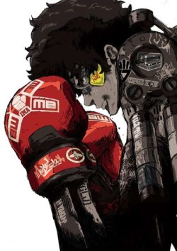

Admittedly, I like white backgrounds. I think they are very impact. On top of that, Joe is essentially black and white with the only colour additions highlighting the boxing aspect of the story, rather than the sci fi mecha one. This makes the spiritual successor to Ashita no Joe angle just a bit more prominent. It’s a simple image of the main character but there is a lot going on. The robotic exoskeleton makes you wonder what the heck is going on and the high contrast makes the image jump at you.
Mononoke
![ポスター文字入り [更新済み]](https://i0.wp.com/drunkenanimeblog.com/wp-content/uploads/2020/06/Mononoke.jpg?resize=251%2C354&ssl=1)

If MegaloBox decided to make it’s mark through a spartan colour scheme and clean design, Mononoke went the opposite way. There is so much going on here. Arguably too much. But it’s that excess that really makes it stand out. Not to mention that Mononoke is a visually excessive show in many ways. In fact, you could argue that the cover is rather tame. Also, there’s not that much dominantly yellow cover art so when I look at my list, this image really pops out!
Monthly Girls Nozaki Kun


In many respects, this is a pretty boring piece of Box Art. However, I realized I hadn’t talked about Nozaki-kun in a while and I thought it was high time I reminded everyone that I really love Nozaki-kun. And also, it’s not at all a bad cover. It has that white framing, the images being disposed like manga panels is relevant to the story and it’s a pretty great way to get close ups of all the characters in one single image. Also there’s a Tanuki and a background image of the school to give us some sense of setting. I just threw in there that there’s a Tanuki with no explanation or detailing why that matters. It matters!
Paranoia Agent

This is one of my favourites..obviously…it’s on my list of favourites. Still Paranoia agent may have the best use of colour in this entire list. The thematically significant red of the background with those darker lines reminiscent of an old TV screen. It frames Golden Bat but it also makes the rest of the cast seem not quite real. If you’ve seen the series you know why that matters. Golden bat has his distinctive uniform which devoid of meaning seems almost cheerful against that background. That huge shadow in front of him is downright ominous and again, he is the only one that casts one. The fact that everyone’s head is cut off makes the entire scene very unnerving.
The Ancient Magus’ Bride


I don’t know what to say…I’ve always liked this image. Even though it really is very creepy. And knowing the events of the anime only makes it creepier. But to me, it looks like a Christmas tree…
The shaft of light and magical vines all combine to create a very unique sort of look and carving out the image in an more triangular shape sets it apart from the overwhelmingly rectangular ones. Still a bit creepy.
Future Diary

I mentioned it in relation to the Paranoia Agent image but I kept it brief to go on in more detail here. Yuno is cut off at the neck. Cutting off characters is always a bit unsettling unless there is just so many of them it sort of blends in. In this case though, there’s only two so it stands out, not to mention that she is pretty much exactly decapitated. However, they are standing on a reflective surface, which still allows the artist to show Yuno’s face but it’s cast in deep shadows. There’s also an unclear silhouette reflected in the background for an extra dose of mysterious and scary. No wonder Yuki looks so uneasy. This one image made me want to see the series so bad.
That’s it for now. Although there are a lot more that I find very pretty. I should say that looking over all the box art in my AniList listing, I noticed that 90% of the images were some type of varying degree of dynamic group shot. It really got super repetitive quickly.
Maybe it’s just a consequence of the anime I have watched.
Do you have a favourite covert art? Is it weird to have one? Or like 12….

